Physical accessibility has seen great improvement since the Americans with Disabilities Act of 1990, but how do we keep up with digital accessibility in a world where groundbreaking technology is announced on a nearly weekly basis?
New technology must be
designed with accessibility in mind
from the beginning.
MyCon, a digital conferencing app and website, aims to do just that.
Created as a conceptual design in consultation with the Indiana Society of Association Executives (ISAE), MyCon is a conferencing app and responsive website designed to be accessible for more users and businesses.
Challenge
Despite increased physical accessibility at convention centers and other venues, accessibility issues such as visibility and auditory limitations, language barriers, and excessive costs for modern digital solutions persist, keeping real solutions largely out of reach for attendees and hosting organizations alike.
Solution
A mobile app and responsive companion website with digital accessibility at the forefront while utilizing existing digital infrastructure from third-party services to keep costs to hosting organizations low.
My Role & Stakeholders
As sole UX Researcher and Designer, I was responsible for each step in the design process from initial user research and ideation through the final high-fidelity prototype. Both the Senior Communications Director and Executive Director of ISAE were consulted at various points throughout the process, and all final designs and research were shared with them upon completion.
Understanding the Users & Market
Initial user research was compiled from user feedback from previous ISAE conferences, third-party reviews of existing applications, and a full competitive analysis.
Primary Pain Points
1
Remote Access
Fortunately many solutions to this problem came to light during the COVID-19 pandemic, but some services only offer this as a premium feature or have separate apps for in-person versus virtual options.
2
Hearing Impairments
While ADA requirements provide many on-site solutions for those with mobility concerns, solutions for hearing impairments are typically not included due to their cost and/or complexity.
3
Language Barriers
For similar reasons to that of hearing impairments, solutions for language barriers are typically left to the features of the individual’s mobile device, which can result in inconsistent experiences.
4
Budget Limitations
Many of the most popular digital solutions for conferencing come with jaw-droppingly high price tags, and the most affordable options are often missing features and/or lack a user-friendly interface.
Existing Solutions
Gaps
None of the event apps had notable accessibility initiatives compared to LinkedIn
Only Whova provides a detailed demonstration video and demo version of the app directly on their website
All apps have potential, and in most cases significant, financial inaccessibility
Some basic user flow features are not intuitive in most apps
Opportunities
Optimize the app to include a baseline of accessibility features: clear sections and headlines, WCAG compliant color schemes and text, language options, and captions for any videos
Create demo and/or preview of all major features
Create financing/subscription options that minimize the weight of any financial obligation
Ensure all basic functionality uses familiar design features such as navigation menus, icons, and messaging features
Design Process
Ideation began with five sketched iterations of each page for the primary user flow.
Each final sketch was translated into a digital wireframe.
Home Page
Agenda Page
Directory Page
Maps Page
Messaging Pages
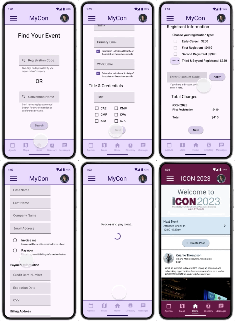
Registration Pages
Lo-Fi Prototype
Digital wireframes were connected into a low-fidelity prototype.
Five users participated in a moderated usability study to make sure the mobile app design was headed in the right direction. These users were tasked with completing registration, adding an event to their agenda, and translating their most recent message, resulting in three key takeaways:
Users needed the home page and its purpose to be more clearly identifiable.
1
Users wanted to be able to easily remove events and add custom events to their agenda.
2
The chat translation feature was difficult for all users to find and use.
3
Mockups were created based on feedback from the usability study and updated wireframes, and these mockups were later connected to create the final high-fidelity prototype.
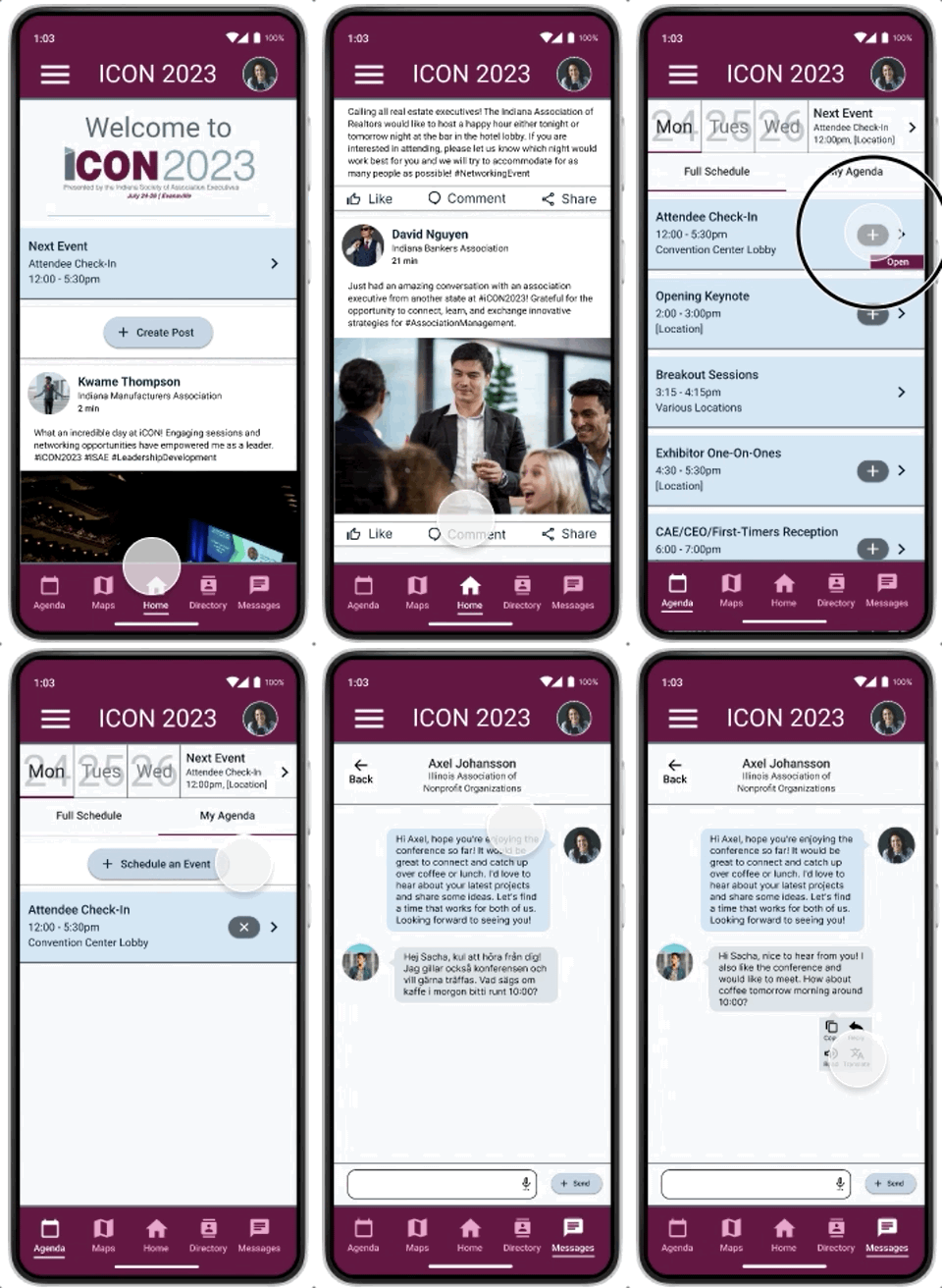
In this final version, we addressed the problems from the usability study with a few key solutions:
Hi-Fi Prototype
The welcome header as well as a more familiar social feed layout on the home page lets users know where they are in the app.
1
Added events can be removed using the “x” icon and the “Schedule an event” feature was added.
2
All chat features in the messaging window are labeled with accompanying text.
3
MyCon Branded Registration
Conference Branded Interface
Creating a Responsive Companion Website
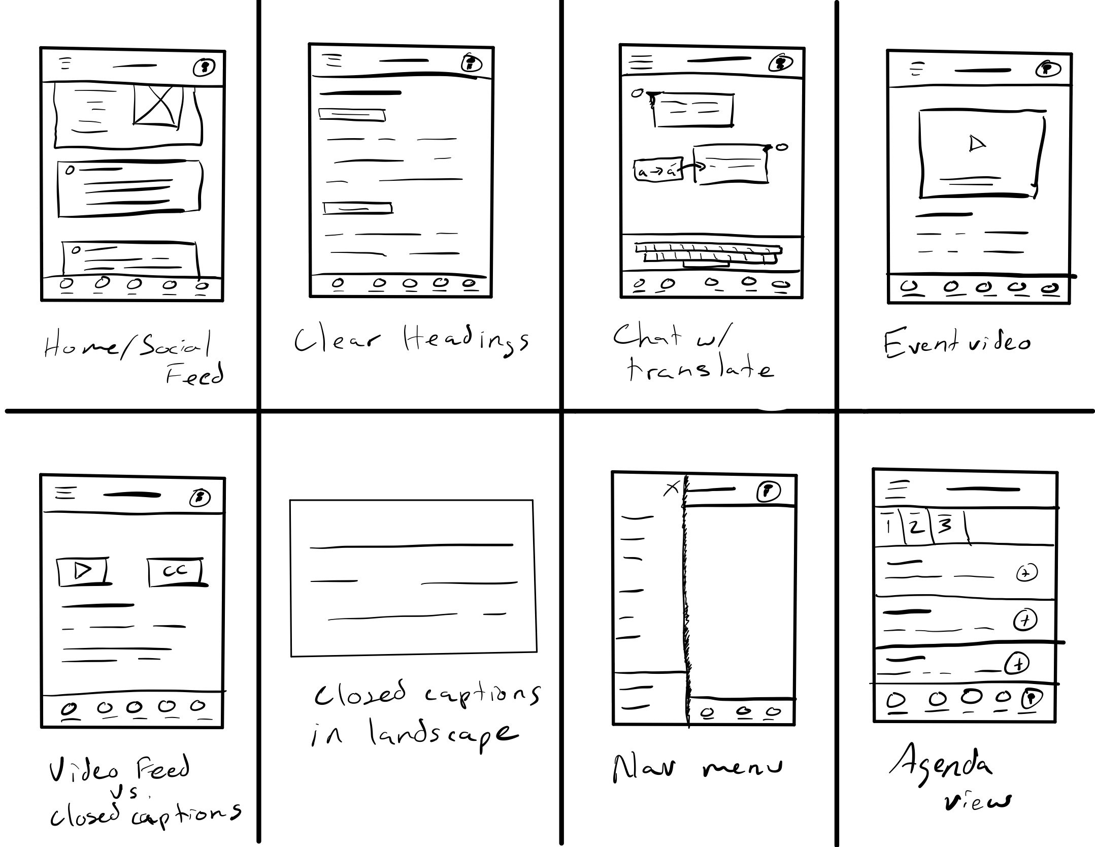
Quick sketches and reflection on how I could continue to improve on solutions in a different medium inspired fresh ideation.
How might I…
…increase accessibility to ensure as many possible attendees can participate either in person or virtually?
…keep the website simple and enjoyable to navigate so that users don’t hit any deal-breaking pain points?
…keep costs down to avoid budgetary concerns being a roadblock to use for organizations/businesses that could benefit from MyCon?
Tablet Layout Sketches
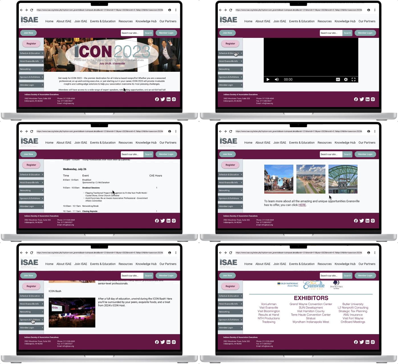
From Wireframes to a Hi-Fi Prototype
The companion site is primarily intended to promote the conference and provide basic web-based resources for remote attendees such as event streaming and the calendar.
So what’s next?
If this app were to be fully developed:
1
Gamification
Gamification for attendees in the form of ice breakers, exhibitor check-ins, casual gaming, and a conference leaderboard would be designed and integrated into the mobile app.
2
Development
The completed design would be handed off to a development team for buildout, including detailed accessibility and functionality notes.
3
Usability Study
A round of beta testing would function as an additional pre-release usability study and final tweaks would be made to the designs prior to full release.
Key Takeaways
Keeping accessibility at the core of design ensures the design will be ready for the next billion users, and going above and beyond valuable standards such as WCAG compliance and screen reader compatibility offers the best chance at pushing the industry forward. One example in this design is that I originally intended to design a live stream that offered captions in the user’s preferred language. Integrating YouTube’s existing infrastructure rather than designing one from scratch not only covers these needs with minimal branding interruption, but it also saves designers and developers valuable time reducing development costs, which can be passed on to hosting organizations in the form of a more affordable product.


