Spearhead Amphitheater is a fictional live music venue.
The accessibility benefits its standalone interface could provide are very real.
Designed with the user at the forefront, this app and website provides a structure that would allow live music venues to thrive without the involvement of third-party ticketing services.
Challenge
The involvement of third-party ticket vendors in local ticket sales has attempted to force a one-size-fits-all approach on unique venues. This has led to more accessibility for scalpers, limited accessibility for the average consumer, widespread confusion, and otherwise avoidable industry bottlenecks.
Solution
A user-centered, venue-hosted mobile app and website that eliminates the involvement of third-party ticket vendors that prioritizes accessibility, consistent functionality, and transparency over scalper-friendly sales tactics.
My Role & Stakeholders
As sole UX Researcher and Designer, I was responsible for each step in the design process from initial user research and ideation through the final high-fidelity prototype including user research, competitive analysis, ideating, wireframing, and prototyping.
Understanding the Users & Market
The first step was understanding existing solutions in the market and the gaps in what they provide.
Existing Solutions
Gaps
Not accessible for non-English speakers
Dense/overwhelming amounts of information in most cases
Checkout processes happen on a third party website, creating abrupt change in branding
Most do not have accompanying mobile app
Opportunities
Translation feature
Create accompanying mobile app for ticket purchases/digital ticket
Embed checkout process into website/app to maintain branding
Next, sample user bios provided as part of Google’s UX Design Certificate were analyzed in interview format to create user personas which were used to identify four primary pain points.
Jasmine
“I only have so much time with my daughter and would love to spend less of it having to navigate through complex websites.”
Age: 43
Education: Doctor of Medicine
Hometown: Baltimore, Maryland
Family: Lives with teenage daughter
Occupation: Family Physician
Problem Statement:
Jasmine is a busy doctor and parent with dyslexia who needs a quicker way to navigate the checkout process because she often gets timed out trying to complete ticket purchases, resulting in extra time spent making multiple attempts to complete the process.
Primary Pain Points
1
Availability
While this is the pain point we likely have the least control over, this concern sheds light on how users tend to plan ahead for concerts and other events.
2
Visual Impairments
Many music venue websites are packed full of information and various branding about upcoming concerts that can be overwhelming for those with visual impairments.
3
Linguistic Accessibility
Many languages are still commonly left out of translation features. It is also commonly difficult for non-English speakers to find a small dropdown in a bottom corner of a page.
4
Event Awareness
Many users don’t have time to look up a venue’s show schedule and wish there was an easier way to track when their favorite artists are performing near them.
Design Process
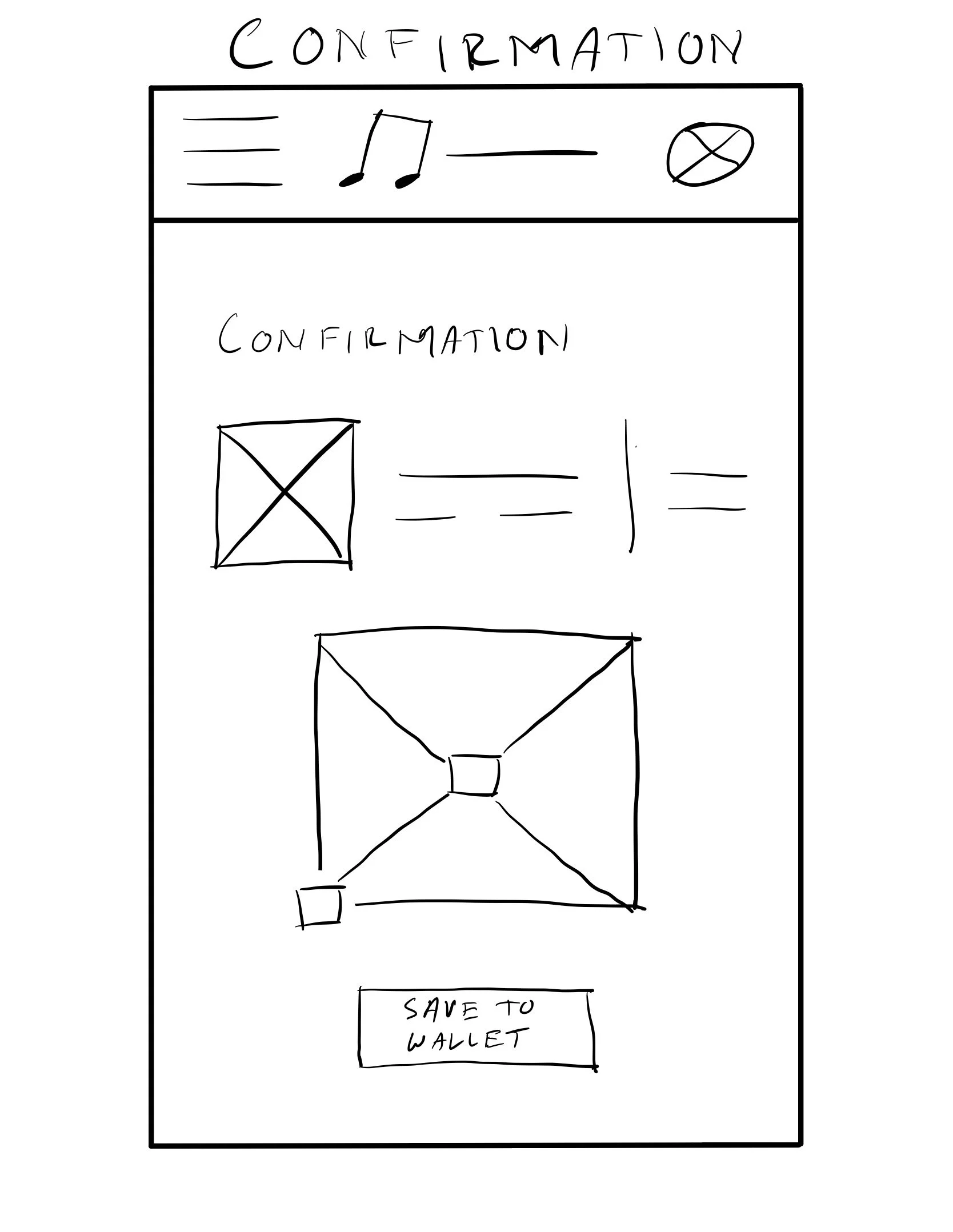
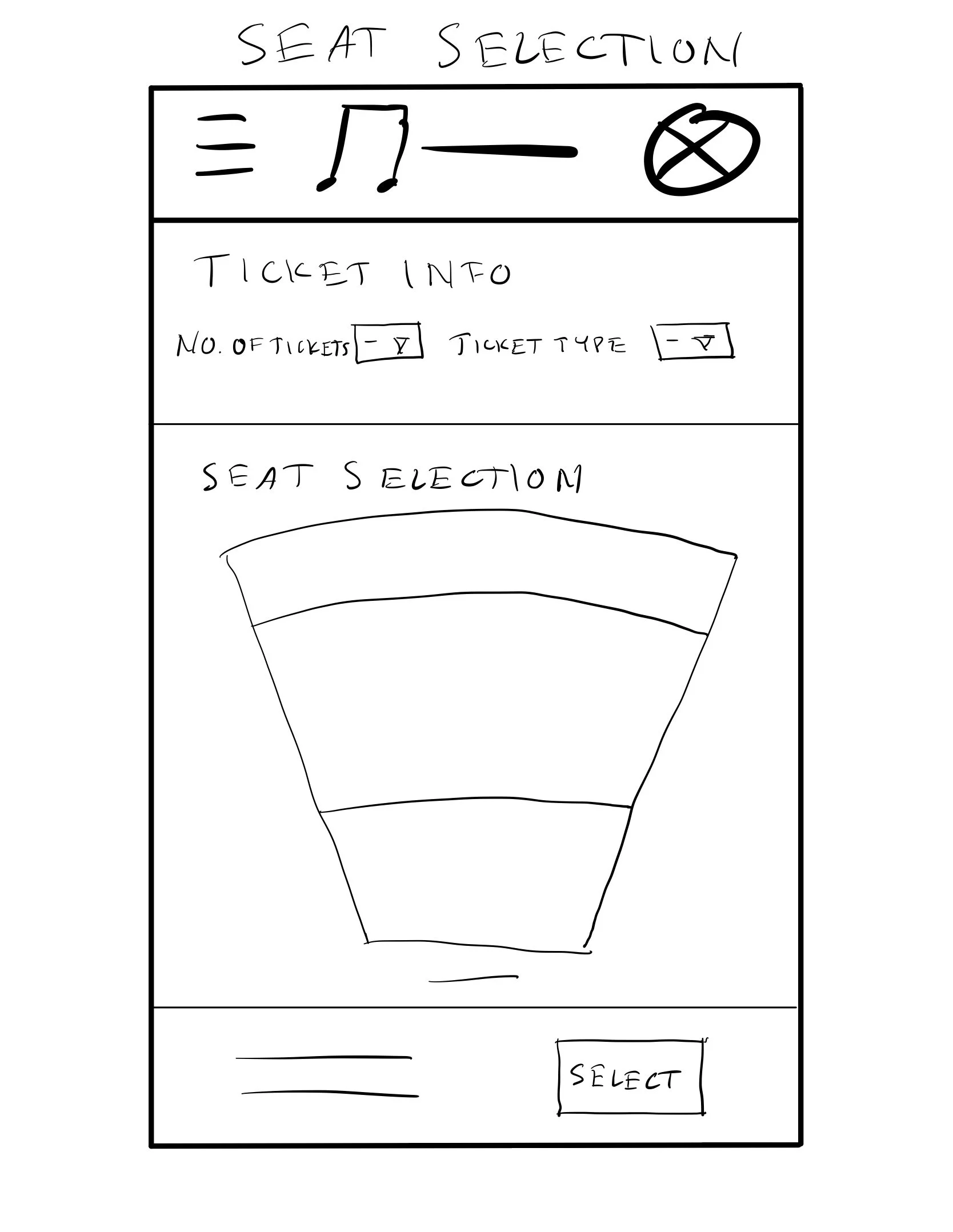
Ideation began by putting myself in the shoes of the user, imagining the typical user flow and sketching initial layout ideas that would be translated into paper wireframes.
Lo-Fi Prototype
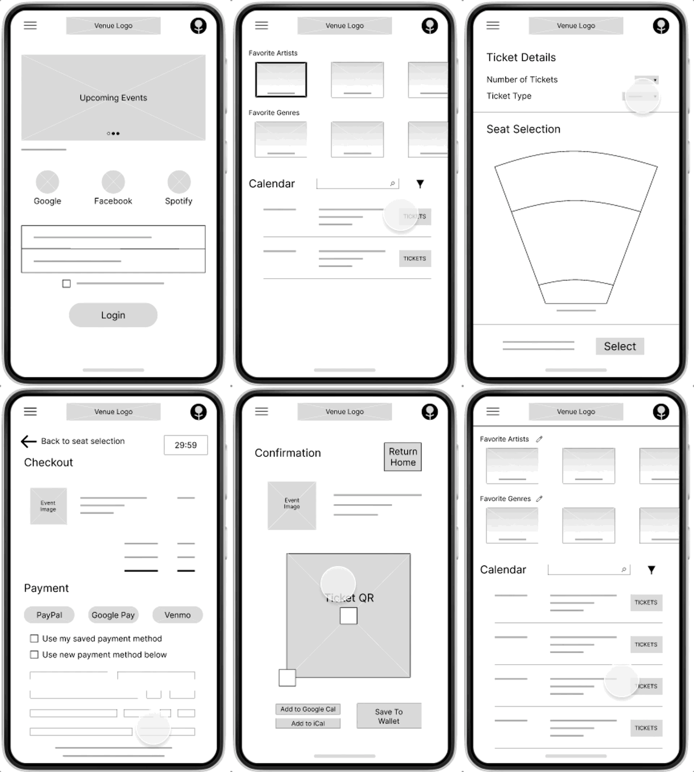
After paper wireframes were translated into digital format, they were connected to create the first lo-fi prototype which underwent user testing.
Six users participated in a usability study that focused on the ticket selection and checkout flow as well as some of the search functions, with three primary takeaways being prioritized in the next iteration.
Users benefit from having various ways to search for an artist.
1
Users need a more accessible way to edit their Favorite Artists.
2
Users appreciate the familiarity of the ticket selection and purchase flow.
3
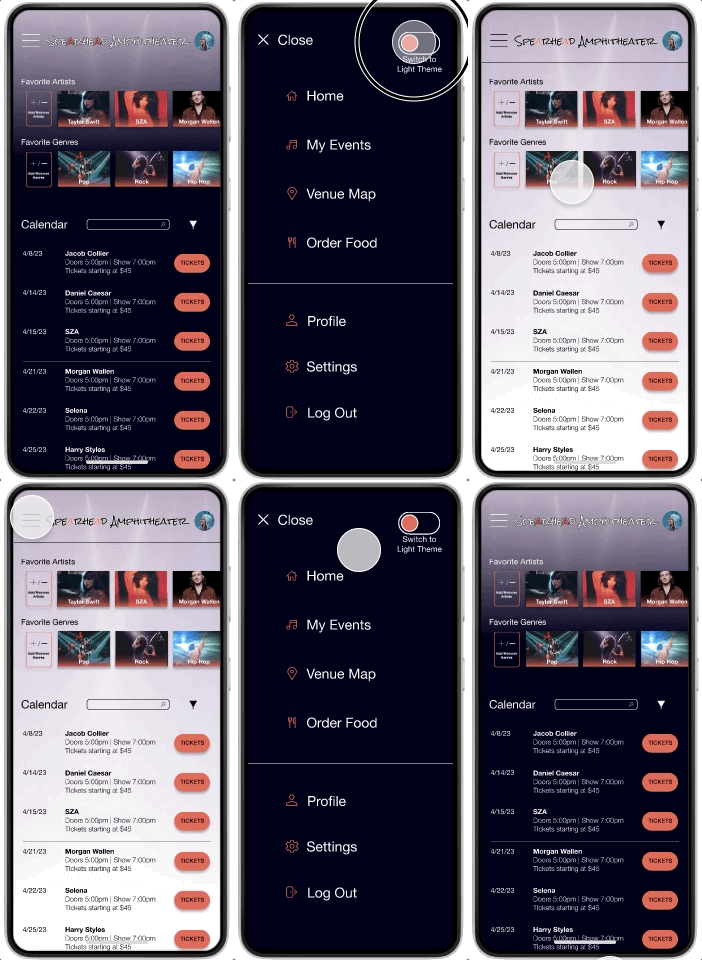
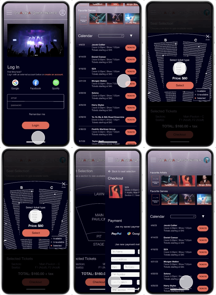
Mockups and a high-fidelity prototype were created with feedback from the first usability study translated into design improvements.
After the first iteration of the hi-fi prototype, five users participated in a second usability study, confirming the success of most updates and inspiring a few others:
Hi-Fi Prototype
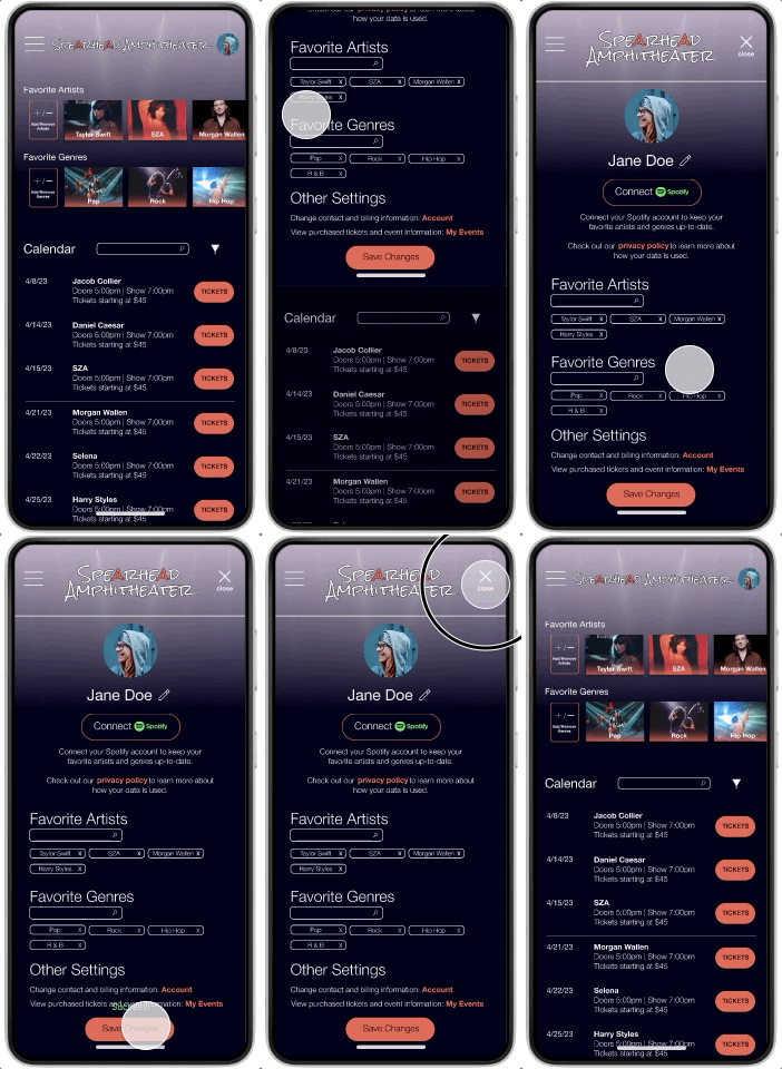
First Iteration: The word “edit” replaced the pencil icon, but users still had inconsistent experiences in figuring out how to edit their favorite artists or genres.
Second Iteration: A new full-height button was added to the scrolling favorite artist and genre lists with a clear label to ensure users could easily find the feature.
1
First Iteration: Users appreciated familiar iconography, but a few icons were still unclear.
Second Iteration: Labels were added to every icon, increasing
2
First Iteration: Users wanted to be able to customize each selected seat rather than sharing settings for the order as a whole.
Second Iteration: Seat selection options were moved to a popup window that appears for each selected seat on the seat map.
3
In addition to feedback-based improvements, both a light and dark version were created to ensure accessibility and responsiveness to different mobile device settings.
4
Creating a Responsive Companion Website
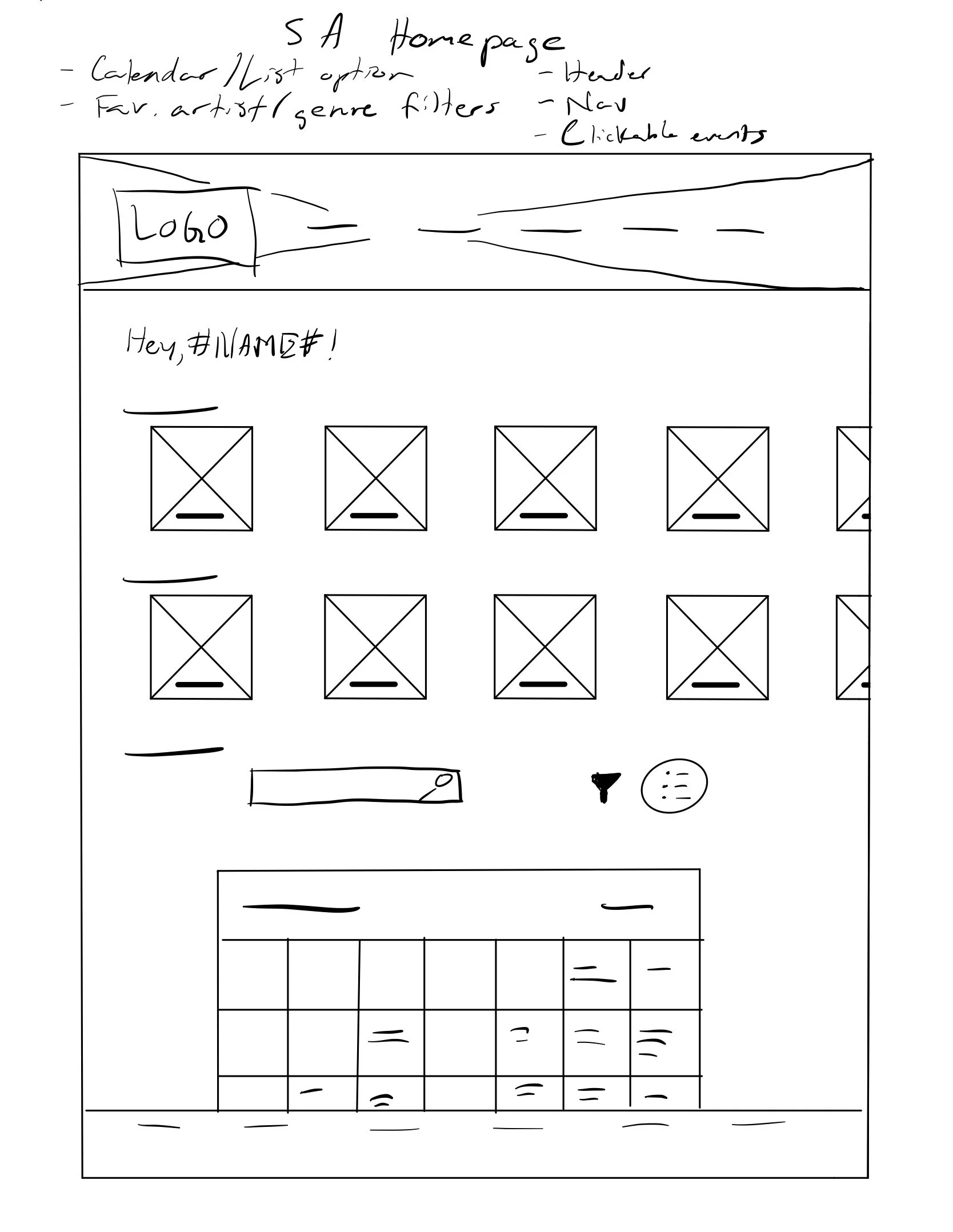
Quick sketches and reflection on how I could continue to improve on solutions in a different medium inspired fresh ideation.
How might I…
…make concert-going more accessible and engaging on the front end?
…inspire users to explore concerts by artists new to them?
…improve on industry standard UI to appear less cluttered and more intuitive?
Prototypes & User Testing
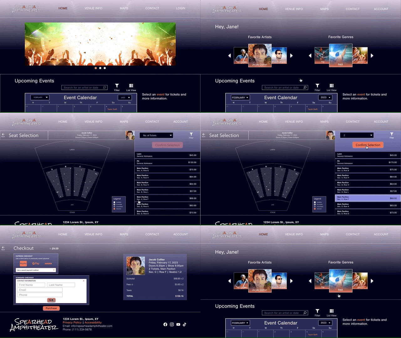
A companion site should be a related but unique format. The Spearhead Amphitheater website is formatted to be a simpler, more intuitive version of other venue and ticketing websites with a profile modeled after streaming apps to create a unique website with familiarity on every page.
Five users participated in a usability study of the first low fidelity prototype. Like the mobile app, this focused on ticket selection and checkout flow, this time with the addition of venue information, resulting in the following primary takeaways:
Users benefit from placeholder text in search and form fields.
1
Users want to do the least amount of searching possible.
2
Users appreciate the familiarity of the flow to that of the mobile app.
3
So what’s next?
If this app were to be fully developed:
1
Finalize Design
Build out remaining features such as the venue map, food ordering, and settings, ensuring consistency between the two. The website should focus on features to prepare users for a concert, while the app should work with it to be a resource for those currently attending a concert.
2
Development & Beta Testing
Work with engineers to release a beta version of both the app and website for a small group of venues in different areas. Usage data will be collected along with voluntary feedback.
3
Final Iteration
Collect data from beta usage after one, three, and six months with an update released within two weeks of data collection. Full version will be released within one month of the final collection, and a final usability study will be conducted approximately three months after the official release.
Key Takeaways
Usability studies as well as informal feedback shows that the consistencies between the mobile app and responsive website foster the desired consistency in branding and accessibility.
The space and functionality of a website allows for more complex functionality without getting in the way of consistent branding and accessibility, but if this idea is exploited too much we may start seeing diminishing returns in consistency.


